
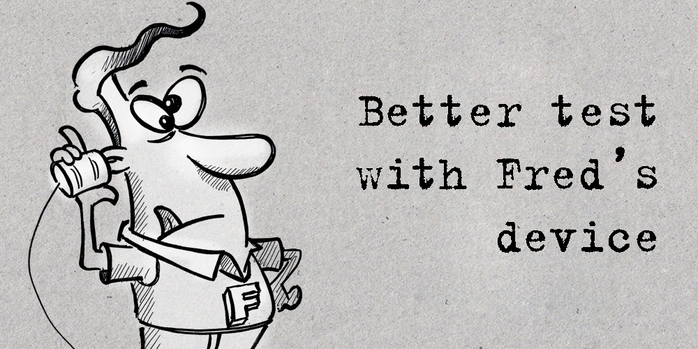
The latest in our series of ‘Fred tests’ (See article: Fred super hero) concerns not just Fred’s individual and unpredictable logic when navigating anything digital, but also the antiquated device that his brother-in-law gave him when upgrading to a Blackberry in 1847.
Now, whereas it is quite reasonable to slap one’s forehead with frustration when watching chaps like Fred stab randomly and fruitlessly at the screen, we have to accept that not everyone – in fact far from everyone – can afford the latest digital devices. Fred is also of the ‘if it isn’t broken, don’t fix it’ school who refuses peer pressure, consumerism, and device crashes, until absolutely nothing works anymore. And who are we to say he’s wrong?
Technological obsolescence has always been the number one headache for digital designers and developers.
At Pont Bleu we tackle communication using the perspective of the end-user experience.
You need to understand your client, what makes them tick, and appeal to them – in a nutshell that’s it.
But when you cannot be sure of how they get your information, how it is displayed, or even if it is displayed at all, then you have a problem.
W3 standards have now given us the stability that was previously only offered by third-party software (like Adobe Flash) and the three main operating systems (OS): Mac (and iOS), Windows and Android are slowly becoming more compatible.
From a designer/developer perspective, the disparities of operating systems are less of a problem than the hundreds of device screen sizes, resolutions, and ratios. Especially at the small end of the scale with phones and watches, designers have to exploit every square millimetre of screen real-estate.
Responsive content that ‘flows’ into the available space has taken the lead over space hogging pixel-perfect design, but the need to appeal to clients means that there has to be an element of designed content, and this is where compromises and break-points decide on how information is laid out on screens.
Ideally, a brand image should be presented harmoniously throughout all digital communication. Though for practicality it’s generally accepted that digital content must be limited in its retro-compatibility of devices. Each designer/developer needs to decide how far back one should go, and what proportion of the potential market you are giving a lack-lustre presentation to.
Enter Fred the techno-duffer
Several development kits propose simulations of different device screens, and these will weed out the more obvious visual problems. However devices that no longer accept OS updates will perform differently, and who’s to say that Fred & Co have updated? Non-compatibility can affect the user experience, functionalities disappear, to the point where your potential clients are simply not getting the info as you wish. Your presentation is poor, your sales funnel dysfunctions, and your branding is chips.
Fred, with the help of his device-retentive friends, will demonstrate how, if you want their business. you need to accommodate them in the user experience.

Branding Consultant at Pont Bleu Communication
Daren Birchall’s career spans more than 30 years. He is a graphic designer, writer, analyst and communications strategist, marketing consultant, media buyer, production manager, and for quite some time was an advertising agent. He loves photography but his glasses bother him.


