
This is the third in our series of articles about how you can wisely profit from the profusion of weaknesses that are so ably supplied by Fred: the most intellectually challenged employee in your company.
In addition to his extended range of shortfalls he also needs to wear 2.0 dioptre spectacles. As we’ve seen in previous articles, Fred is not alone; short-sightedness is suffered by more than 40% of Northern European people over 40 years old. So even if this could be described as a handicap, it is by no means rare.
Except that Fred, true to form, really should be wearing 4.0 dioptre glasses. He hasn’t got around to replacing them and let’s face it, the price of prescription glasses is calculated by a shady pan-European cartel of daylight-robbing mafia opticians, to stay beyond the pocket of common mortals, according to Fred.
Legibility
Legibility is our ability to distinguish the forms of letters, words and ideograms, clearly enough to make some kind of sense of them. It’s also a pretty useful attribute when building a brand.
There are many things that affect legibility.
Firstly, in Fred’s case, a fuzzy, out-of-focus letter is harder to read than a crisply defined letterform. Then – closely-related when out-of-focus – a small letter is harder to define than a large one.
But there are other factors that influence our ability to interpret letterforms, such as their weight (the thickness of the letter). It’s generally assumed that if a letter is in its bold version then it will stand out more (it’s being bold after all) and that the bolder (thicker) the letter, the easier it is to read, right? Wrong: the holes in characters are part of the shape and when the letter gets thicker, the hole can all but disappear.
Recognition and understanding of shapes is another field in our ability to decode their meaning.
If Europeans cannot generally read Kanji, Cyrillic or Arabian it’s because they do not know what these shapes represent. Just as you cannot read your doctor’s writing, yet your pharmacist can. The same situation arises when a designer uses a grungy cool font. There is a moment of interpretation, sometimes only a second but in the cases of more unstructured fonts they will not be understood.
If traffic signs are written in medium-weight, crisp, reasonably sized, black on white, sans-serif lettering; it is because we see them from a distance, in uncertain lighting or weather conditions, and sometimes at speed or with peripheral vision (out-of-focus).
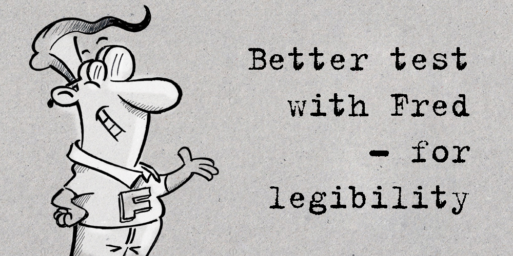
This is also why the Fred legibility test is so important when you are designing anything.
Test, test and test again
Get him to read your instructions for placing contact lenses, in a poorly lit bathroom. Get him to spot your product on the supermarket shelves. Ask him to scan though your stuff, explain what he sees, what stands out (note what doesn’t too), and especially, what he understands.
Smirk a little as he holds your cutely designed brand messages at arm’s length and squints. But don’t forget, one day you may well be in his position – and when that day arrives, think of the thousands of sales you’ve missed by using illegible lettering.

Branding Consultant at Pont Bleu Communication
Daren Birchall’s career spans more than 30 years. He is a graphic designer, writer, analyst and communications strategist, marketing consultant, media buyer, production manager, and for quite some time was an advertising agent. He loves photography but his glasses bother him.


