
In a recent article we talked about how an imaginary dumb employee called Fred could be used as a test for improving just about everything a company has to offer. (see the article Fred superhero)
In this article we will concentrate on just one of his setbacks that could save a designer’s bacon: he has a slight red-green colour-blindness.
Fred is not alone with this symptom. A whopping 8 percent of men and 0.5 percent of women with Northern European ancestry have this common form of inherited X chromosome color blindness.
That’s one huge chunk of the market that no company can afford to miss. And yet many do by displaying their brand messages in colour combinations that are hard to see for the likes of Fred.
Now before we go into what you should and shouldn’t do to accommodate this market chunk, remember that many people who are colourblind are embarrassed by this and as many eye problems imply getting old, some people will pretend that they still have the keen eye of their youth.
Fortunately for you, Fred couldn’t care less about what you think and is happy to tell you when you’re being stupid.
Colour-blindness
Red-green colour-blindness doesn’t necessarily mean confusing traffic lights, but mid tones of both colours are on very similar wavelengths and are easily confused.
To explain this in simple terms, think of tomatoes. They start green and they ripen to red. At some point the green becomes red and as any painter will tell you, you can’t make red with green or vice-versa. There is a moment at which tomatoes are neither colour, and it’s around this point that Fred has a spot of bother.
Without boring you, this inability to distinguish colours boils down to the wavelength of light reflected by a colour. And of course it isn’t limited to red and green; you can screw up your branding with just about any two badly chosen colours.
Below are a few examples of 2 poorly chosen colours used for a logo and to the right what a completely colour-blind person will see.
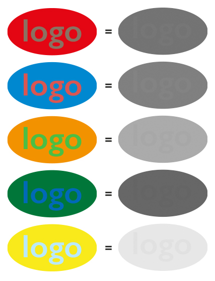
What this amounts to is that the tonal values of the lettering and backgrounds are lacking contrast.
And that Fred didn’t get your branding message.

Branding Consultant at Pont Bleu Communication
Daren Birchall’s career spans more than 30 years. He is a graphic designer, writer, analyst and communications strategist, marketing consultant, media buyer, production manager, and for quite some time was an advertising agent. He loves photography but his glasses bother him.


